
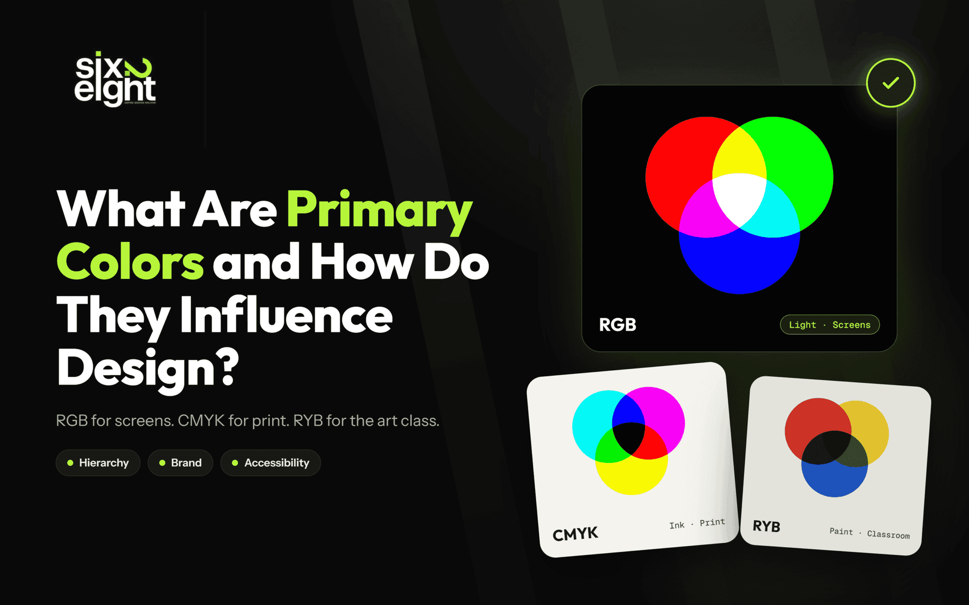


Primary colors are the base colors of a color model that can’t be mixed from other colors in that model. There are three main sets: red, yellow and blue (RYB) for paint, red, green and blue (RGB) for screens, and cyan, magenta, yellow and black (CMYK) for print. In design, they shape visual hierarchy, brand recognition and accessibility.
- For screensRGB, with sRGB as the web default
- For printCMYK, with black ink for depth
- For accessibility4.5:1 text contrast, never color alone
We design interfaces for a living, so this guide treats primary colors as a working tool, not a grade-school fact. It covers the three primary-color models and why red-yellow-blue is a useful myth. It also covers how digital color renders across devices, and how to use primary colors for hierarchy, brand, and accessibility.
What Are Primary Colors?
Primary colors are the base colors of a color model that cannot be created by mixing other colors in that model. All other colors are mixed from them. The primaries depend on the medium: red, green and blue (RGB) for light on screens, cyan, magenta, yellow and black (CMYK) for print ink, and red, yellow and blue (RYB) for paint.
RYB vs RGB vs CMYK
Which primary colors to use, and where
| Model | Type | Primaries | Medium | Where you use it |
|---|---|---|---|---|
| RYB | Subtractive (pigment) | Red Yellow Blue | Paint | Traditional art and color-theory teaching |
| RGB Screens | Additive (light) | Red Green Blue | Light | Web, apps and any digital display |
| CMYK Print | Subtractive (ink) | Cyan Magenta Yellow Key (black) | Ink | Magazines, packaging, brochures |
Are Red, Yellow, and Blue Really the Primary Colors?
No, red, yellow and blue are not scientifically accurate primary colors. RYB is a centuries-old teaching model from painters’ color-wheel theory, created before the science of light and pigment was understood. The accurate subtractive primaries are cyan, magenta and yellow, because red and blue can themselves be mixed: red from magenta and yellow, blue from cyan and magenta.
RYB is still taught because it is simple and works for introducing color mixing, the color wheel and hues. As commenters on r/askscience point out, red is a mix of magenta and yellow, so it can’t be a true primary.
RYB vs RGB vs CMYK: The Three Models in Depth
Each model answers one question: are you adding light, or subtracting it with pigment or ink?
For design work, use RGB for screens and CMYK for print, and treat RYB as a teaching aid.
RYB
Teaching aidSubtractive · pigment
The traditional art model. Mixes paint toward orange, green and purple. Its gamut is limited and its primaries aren’t physically accurate.
RGB
ScreensAdditive · light
Mixes red, green and blue light. It matches the eye’s three cone types (Young-Helmholtz theory), and every screen you design for uses it.
CMYK
PrintSubtractive · ink
Inks absorb light: cyan absorbs red, magenta absorbs green, yellow absorbs blue. Black is added for sharp text, rich shadows and less ink.
The three models differ because each answers a different physical question: are you adding light, or subtracting it with pigment or ink? Get that wrong and your colors shift in ways no amount of tweaking fixes.
RYB is the traditional art model
RYB mixes pigments toward orange, green, and purple, and it is the model most art schools still use to teach fundamentals. Its gamut is limited and its primaries are not physically accurate, which is why modern tools moved past it. Treat RYB as a teaching aid, not a production system.
RGB is the additive model built on human vision
RGB mixes red, green, and blue light, and pushing all three to full brightness produces white. It maps to the Young-Helmholtz trichromatic theory: the retina has three cone types, each tuned to a different wavelength range. Every screen you design for is RGB, which is why it is the only model that matters for digital work.
CMYK is the subtractive model for print
CMYK uses inks that absorb light instead of emitting it: cyan absorbs red, magenta absorbs green, and yellow absorbs blue. Those three inks cannot produce a clean, deep black, so black (Key) is added for sharper text, richer shadows, and less ink. Design for print in CMYK, because a screen-perfect RGB file will shift when it hits paper.
Color models beyond the big three
Several other systems handle measurement and software precisely. CIE XYZ and CIELAB are device-independent reference spaces used to measure color differences and build ICC profiles. HSL and HSV describe hue, saturation, and lightness separately, which is why they are common in design software. Pantone (PMS) is a proprietary spot-color system for reproducing exact brand colors in print.
How Primary Colors Work in Digital Design?
In digital design, primary colors work through the RGB model: every pixel on a screen mixes red, green and blue light at different intensities to create each color. In standard 8-bit color, each channel has 256 levels, giving about 16.7 million colors, and every hex code (such as #FF0000 for pure red) is simply an RGB value. The same value can still look different across devices, because each screen has its own color gamut and calibration.
Bit depth: how many colors a screen shows?
An 8-bit display renders about 16.7 million colors, from 256 shades per channel. A true 10-bit display renders 1.07 billion colors, from 1,024 shades per channel, which is roughly 64 times more. More depth means smoother gradients with less banding, but 10-bit does not automatically mean HDR. Calibration, gamma, and white point still change how the same value appears.
Color spaces and display gamuts
RGB stores a value, but each screen shows only a limited range of colors, called its gamut. A color space defines how devices interpret those values. The three gamuts you will meet most often are below.
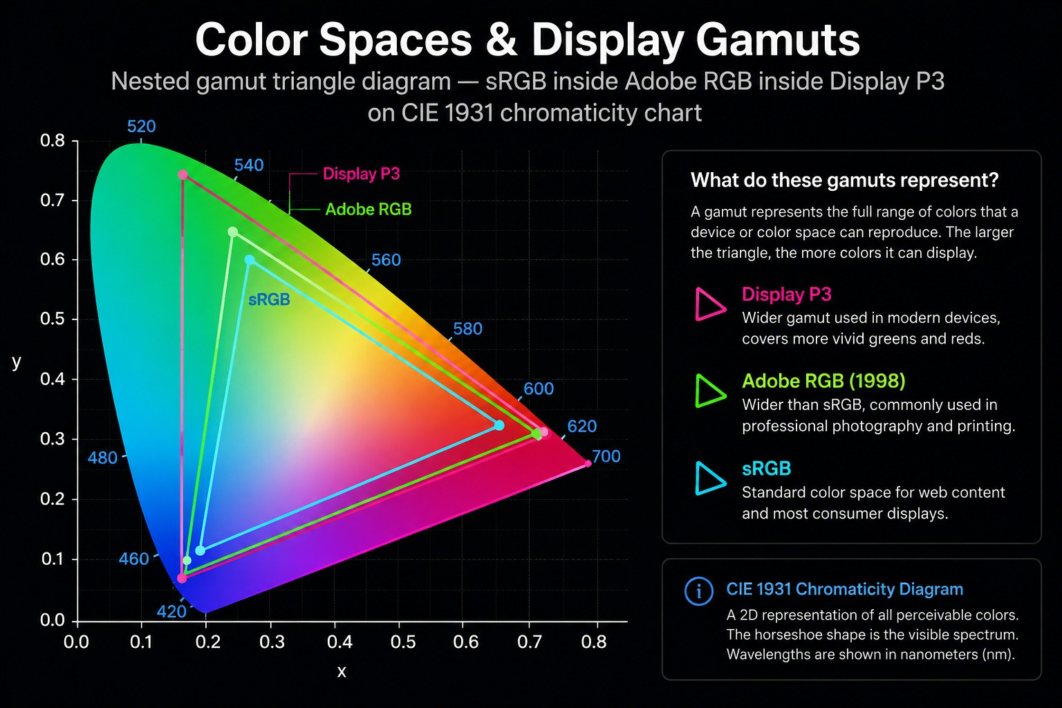
- sRGB: The safe default for the web. Nearly every browser, operating system, and consumer display supports it, so colors stay consistent. It covers roughly a third of the CIE 1931 color space.
- Display P3: Wider than sRGB, especially in reds, oranges, and greens. Most modern phones, tablets, and premium laptops support it, and so does Figma, but sRGB is still safer for general web work.
- Adobe RGB: Pushes further into greens and cyans and suits photography and print. It is a poor fit for the web, since most browsers are tuned for sRGB.
Modern CSS keeps up with this. The CSS Color Module Level 4 spec supports wider spaces like Display P3. It adds functions such as oklch() and color-mix() for perceptually accurate control directly in CSS. Compatible devices show richer colors while standard sRGB displays still render correctly.
Color management keeps colors consistent
Color management uses ICC profiles so the same color renders as accurately as possible across devices, following this chain:
The Color Management Workflow
How a color travels from your design file to a user’s screen
-
Design file
Your colors as created in Figma or Photoshop
-
Color profile
An ICC profile defines what each value means
-
Color-aware app
Reads the profile and converts colors
-
Operating system
Manages color for the whole screen
-
Browser / renderer
Interprets sRGB or Display P3 in CSS
-
Display hardware
The panel shows the final color
One weak link breaks the chain. If any step doesn’t support color management, brand colors can look desaturated, oversaturated or simply wrong.
Every link must support color management, or a brand color can look desaturated, oversaturated, or simply wrong. Figma, for instance, displays both sRGB and Display P3 and converts between them while preserving as much accuracy as possible. Even then, the same hex code looks punchier on an OLED phone, warmer on a MacBook with True Tone, and flatter on an older monitor.
A bright Display P3 orange button can look vivid on a new iPhone and noticeably duller on an sRGB laptop. Always test primary colors on real devices.
Why Primary Colors Matter in Design?
Primary colors shape how users notice, understand, remember, and act, not just how a screen looks. Chosen well, they drive visual hierarchy, usability, accessibility, and brand recognition at the same time.
The five effects that matter most are below.
1. Visual perception: The brain processes color before text, so a primary color pulls attention first. Paired with contrast, spacing, and placement, it builds a hierarchy that highlights buttons, navigation, and key actions, which speeds up scanning and task completion.
2. Cognitive recognition: Using one consistent color for one type of action supports recognition over recall, a core usability principle. It lowers cognitive load, speeds decisions, and makes interactions predictable, while reinforcing brand identity across every screen.
3. Emotional response, honestly: Color influences feeling, but the popular “red means urgency, blue means trust” chart is convention, not science. Practitioners are right to be skeptical of universal color psychology (r/Design). Associations shift with culture, context, and expectation, so choose colors that fit the product and brand, not a universal key. The table below lists common Western conventions, useful as a starting point, never as fact.
Common Color Associations
Western conventions: a starting point, not a rule
| Color | Hex | Common Western associations |
|---|---|---|
| Red | #FF0000 | Energy, urgency, confidence |
| Yellow | #FFFF00 | Optimism, warmth, attention |
| Blue | #0000FF | Trust, stability, calm |
Color meaning shifts with culture and context. Test colors with your real audience.
Bold reds and deep blues, for example, are often chosen to project authority, a strategy we cover in what color represents strength.
4. Inclusive design: A primary color should never carry information on its own. Following WCAG 2.2, pair color with icons, labels, or patterns and keep sufficient text contrast. Then people with color vision deficiency can still use the interface. We cover how WCAG 2.2 and personalization are reshaping systems in our UI/UX design trends.
5. Consistent experience: Consistent primary colors create familiar patterns and a stronger brand. Modern design systems use semantic color roles and design tokens to hold that consistency across web, apps, and platforms. That reduces confusion and builds user confidence.
Primary Colors in Branding and UI
In a design system, brand colors are defined as their own design tokens, which keeps the whole palette organized and easy to change. In the interface, primary colors carry the buttons, navigation, links, active states, and focus styles, the elements users interact with first.
Strong design systems also plan for light and dark themes. Rather than simply inverting values, they adapt primary colors so each one stays recognizable, accessible, and consistent in both environments. The same tokens keep the palette unified across phone, tablet, desktop, and wearable, despite different screen sizes and gamuts.
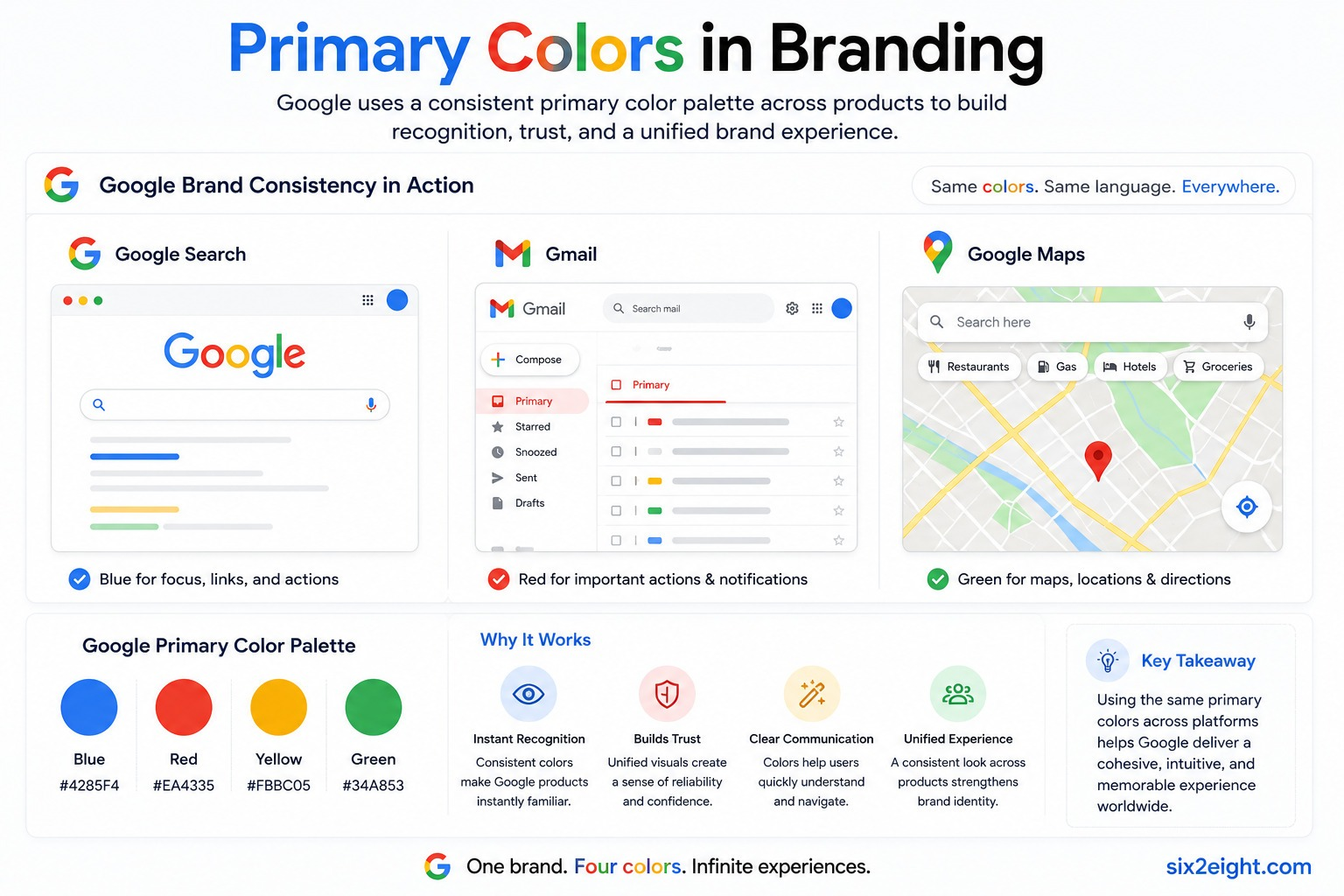
Google is the clearest example. Its blue, red, yellow, and green appear consistently across Search, Gmail, Maps, Drive, and Android, which reinforces the brand while keeping the ecosystem visually cohesive. Building a system like this is core to brand identity design.
How to Use Primary Colors Effectively
Using primary colors well is about balance, hierarchy, and consistency across devices, not just adding color. Three practices do most of the work.
1. Apply the 60-30-10 rule as a guideline
The 60-30-10 rule splits a palette into a dominant color at 60%, a secondary at 30%, and an accent at 10%. The accent is usually reserved for calls to action.
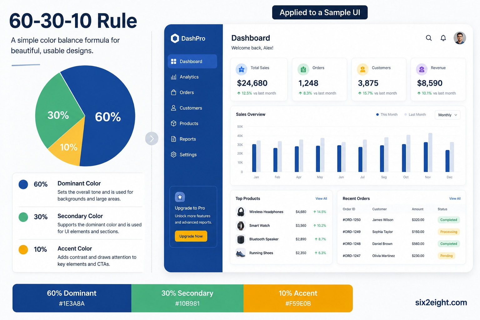
It gives a fast, balanced starting hierarchy, but treat it as a guideline, not a law. Experienced designers adjust the ratios for content density, whitespace, and brand. Many note it is a decorative rule that matters less than contrast and white space (r/graphic_design).
2. Pair primary colors with neutrals
Pairing a vivid primary with neutrals such as white, black, gray, or off-white lets it stand out without overwhelming the user. Neutrals reduce visual competition, cut fatigue, and improve contrast while keeping brand identity intact.
Adjusting saturation and tone within the palette adds harmony without adding new hues.
3. Prioritize accessibility, then verify
Accessibility is a requirement, not a finishing touch, so build it into the palette. The checklist below covers the essentials.
WCAG 2.2 Contrast Minimums
Level AA requirements for primary colors
| Element | Minimum contrast | Examples |
|---|---|---|
| Normal text | 4.5:1 | Body copy, labels, links |
| Large text | 3:1 | 18pt+, or 14pt+ bold headings |
| UI components | 3:1 | Buttons, input borders, icons, focus rings |
Accessible Color Checklist
Six checks before your palette ships
Meet WCAG contrast
Use at least 4.5:1 for normal text and 3:1 for large text and UI components.
Use semantic roles
Assign colors by purpose, such as primary, success, warning and error, so the system scales cleanly.
Never rely on color alone
Pair color with icons, labels or text so meaning survives for color-blind users.
Check relative luminance
Two colors with the same contrast value can still read differently to the eye.
Test across environments
Verify in light mode, dark mode, different panels and varied lighting.
Validate with tools
Run contrast checkers and color-blindness simulators before you ship.
FAQs
Are red, yellow, and blue actually primary colors?
Red, yellow and blue are primary colors only in the traditional RYB art model, which is not scientifically accurate. The accurate subtractive primaries are cyan, magenta and yellow, and additive light uses red, green and blue. Designers use RGB for screens and CMYK for print, and treat RYB as a teaching aid.
What is the 3-color rule in design?
The 3-color rule in design usually means the 60-30-10 rule: a dominant color covers 60% of a layout, a secondary color 30%, and an accent color 10%, often for calls to action. It creates a quick, balanced hierarchy, but designers adjust the ratios to fit the content and brand.
What are the primary colors in RGB?
The primary colors in RGB are red, green and blue, mixed as light. Combining all three at full brightness produces white, which is why RGB is called an additive model. Every digital screen uses RGB, so it is the default for web and app design.
What are the primary colors in CMYK?
The primary colors in CMYK are cyan, magenta and yellow, plus black (K). These inks absorb light, so mixing them darkens color, which makes CMYK a subtractive model. Black is added because the three inks alone cannot print a clean, deep black.
Why do screens use RGB instead of RYB?
Screens use RGB because they emit light, and RGB is the additive model that matches how light mixes and how the eye’s three types of cone cells perceive color. RYB describes paint mixing, not light, so it cannot accurately represent on-screen color.
What is the difference between a primary color and an accent color in design?
In a design system, the primary color is the main brand color used consistently on key UI elements like buttons, links and navigation. An accent color is used sparingly to highlight secondary actions, notifications or emphasis. The primary color builds recognition; the accent color directs attention.
Conclusion
Every button users tap, every brand they remember and every page they can actually read comes down to a few color decisions. Get the model wrong and your brand shifts between screen and print. Get it right and color starts doing real work for you.
The formula is simple: RGB for screens, CMYK for print, and RYB for the art classroom. Build every palette on contrast and accessibility, not color-psychology myths, and keep it consistent with design tokens so it holds up on every device.
Not sure your colors are pulling their weight? At six2eight, we build color systems that look right on every screen and turn visitors into customers. Let’s make your brand impossible to miss.
With 25+ years in UI/UX and web development, I’ve seen what makes users stay and what makes them leave. Most design issues aren’t just visual; they’re about clarity and flow. At six2eight, we craft intuitive experiences that turn frustration into engagement and clicks into customers. Let’s build something that works.